What I decoded from Encode (a data visualisation conference)
September saw the inaugural Encode conference take place at Oval Space in East London. As someone who considers part of their job to be a data visualisation designer across multiple StatsPerform brands, attending seemed a no-brainer.
A venue more synonymous with chemical creativity (Oval Space is an evolving multi-use arts and events organization a night club, for the uninitiated) rather than the data visualisation kind, roughly 400 people were in attendance to hear speakers cover topics across information design, journalism and education.
In this short blog, I’ll look to recap some of the key themes from the day, and some learnings I’ll be applying going forwards.
# 1 – Sketching is the most powerful tool we all have access to
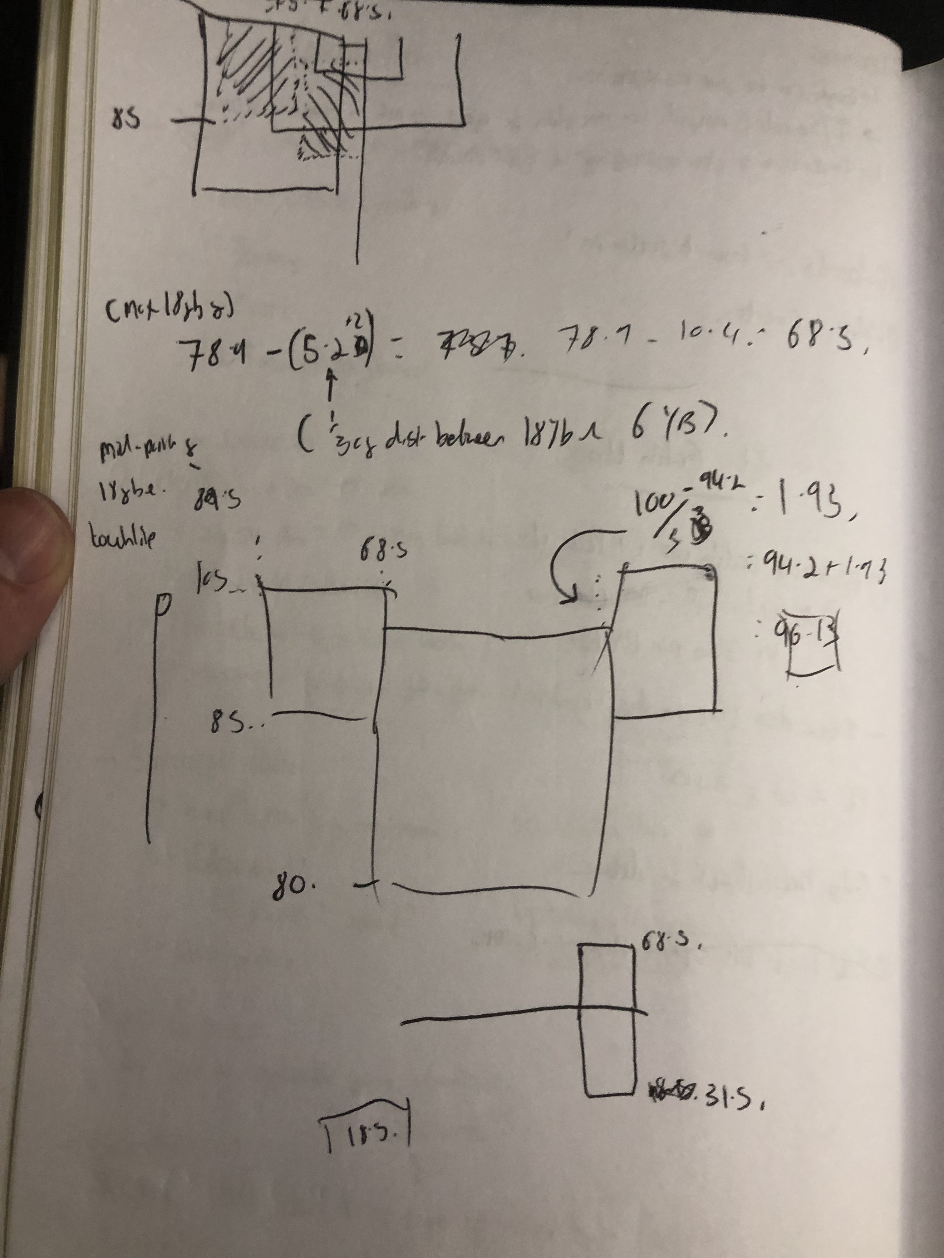
In Valentina D’efilippo’s talk Sketching Superpowers: A celebration of design through sketching, the audience learnt about Valentina’s process when it comes to data visualisation design. As someone without a technical background, Valentina’s primary tool is sketching – which she is very good at.
There are multiple reasons why sketching is so powerful as a tool in data visualisation design (or design in any domain, really). To start with, anyone with a pencil and paper can sketch. There are no barriers in place around getting started - you’re only limited by your own creativity. Secondly, by not starting with code, you are not limiting your thinking to the confines that come with actually building a visualisation. There are creative ways around this, but nothing beats a bit of scratch work on paper before building the real thing.
Valentina’s talk about sketching really hit home to me as someone who will look to draft visualisations or explain concepts within my notebook. If you want to see 101 badly drawn pitch plots, feel free to drop me an email.
Valentina also made a great comment around design in general. While the old adage states that “writing is thinking”, there’s also a point to be made that “design is decision making”. Specifically, when it comes to designing visualisations every single choice you make about what it looks like comes back to a decision being made.
For example, check out Opta’s player-age matrix below:
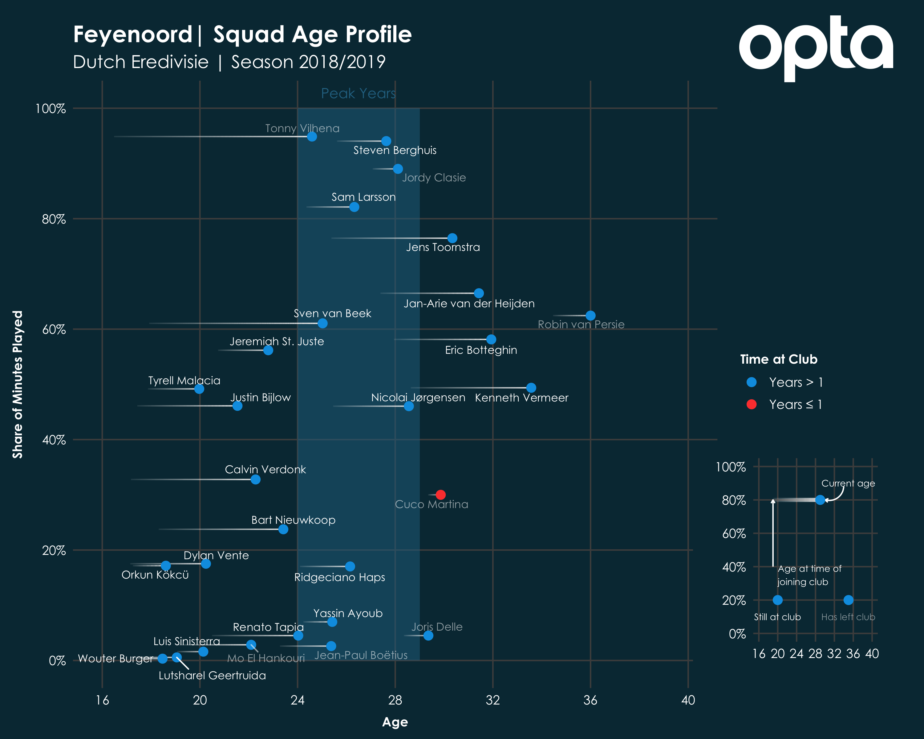
When it comes to the design of this visualisation, plenty of decisions had to be made:
- How do we display time spent at the club?
- How do we explain this visualisation to those without domain expertise?
- What colours do we use?
- What font do we use?
- And so many others…
From now on, I’ll be looking to sketch out new visualisations first, before committing those ideas to code. Additionally, I implore others to consider where sketching out ideas can help be a time-saver before creating “proper” work.
# 2 – Focus on the Moments that matter to shape your work
In Gert Franke’s talk, where he gave a potted history of his own journey as a designer and the lessons learnt as co-founder of Dutch design firm Clever Franke, there was a great mantra for how design and decision making can go hand-in-hand.
The mantra was about identifying the “Moments that matter” when you need data to help make a decision. For multiple roles within football, the applications of this mantra are obvious from a product development point of view:
- Who are the people using our tools?
- E.g. First team analysts, coaches, directors of football
- What are their needs?
- E.g. Quick access to opposition styles, summaries of these styles to impact training schedules, an understanding of how the team is performing vs results
- What are the moments that matter to them?
- E.g. Quick access to answers when a coach asks a question, video clips to run through with the head coach pre/post-match, key points for weekly meetings with chairman/coach
An example of Clever Franke using this mantra in action can be seen below:
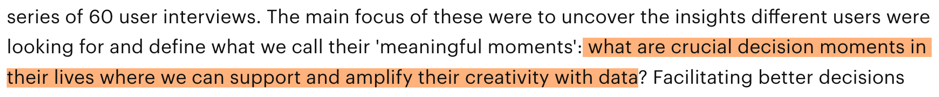
This was from an interview about the process of their recently completed project with Warner Music Group. By capturing data through a series of 60 interviews with key stakeholders, Clever Franke were able to drill down to these moments and build the product and its use cases around them.
My takeaway here is by leaning on clients more to capture these “moments”, we’ll be able to provide products and services that more accurately meet their needs and provide them with data to make better decisions.
What good is a product if, in a key part of the decision-making process, it’s not providing the right information to coaches, analysts and directors of football?
# 3 – Data viz is getting more “informal”, “sonification” is growing and “participation” is up
When you think of data visualisation, more often than not people think about fancy bar charts or interactive experiences that showcase a dataset in an engaging way. Recently, though, there’s been growth in the creation of more sound-based and physical data visualisation. Andy Kirk pointed this out, among 29 other trends, in his talk Data Visualisation: State of the Union 2019+.
For example, Signal Noise released a great project back in 2018 in a unique collaboration between Siemens, Bayern Munich and The Economist. Signal Noise visualised crowd noise data from Bayern’s Allianz Arena, and showed how fans reacted to different players being on the ball, areas of the stands that were most vocal, and various other angles.
While this is a very bespoke dataset, it shows how sound is a largely untapped form of data, which can be visualised. On the flipside (taking data and turning it into sound) we can get pieces like this from the FT, in which the yield curve of a Government bond can be turned into music.
While it remains to be seen whether this form of content is a gimmick or here to stay, I’d imagine we’re going to see more abstract data visualisation forms over the coming years.
Another of the trends pointed out by Kirk is that chart titles are becoming increasingly informal. I feel that John Burn-Murdoch has really led the way here, using the title as a means of telling the story. Here’s one such example.
I’ve tried to follow John’s lead recently, moving away from chart titles like this to something more like this. The benefits of this approach are obvious – people want to be told a story, and not look at dry graphics with dull titles. Maybe this is down to social media forcing us to increasingly compress work into the most succinct and slim form possible, or because people such as John have a large following because they do this so well.
Finally, “participation viz” is up. Take this example from FiveThirtyEight about the 2018 midterm election forecasts in the United States. “Participation viz” essentially being any visualisation that takes input from the user to change the content and how it’s consumed.
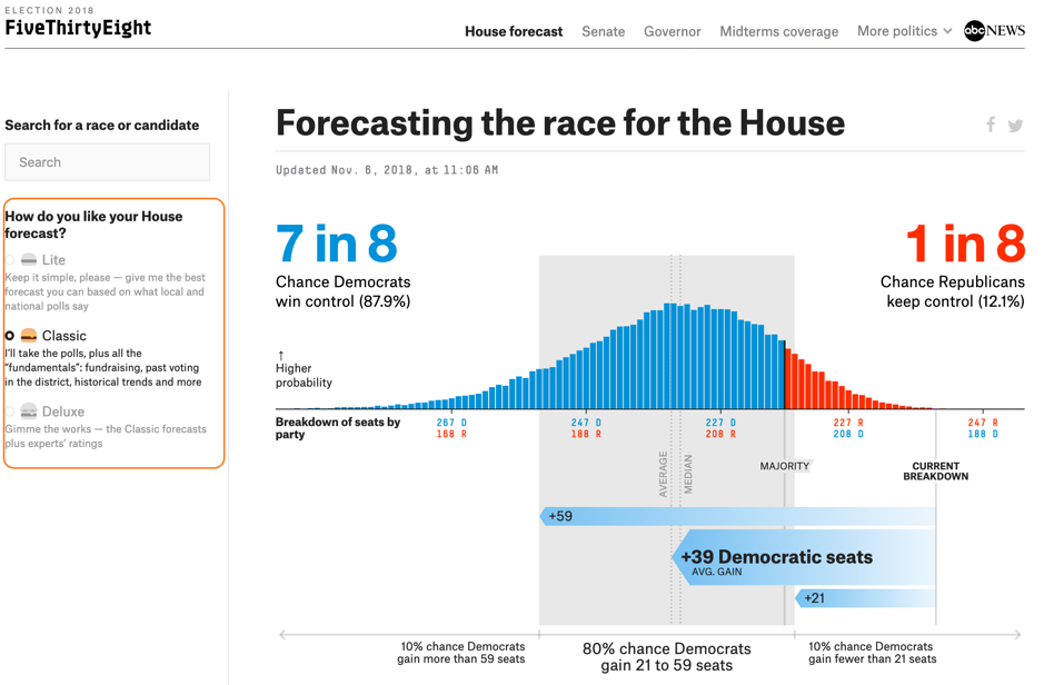
The hamburger menu on the left-hand side can be adjusted, changing the rest of the content in the piece. The “participation” here is the user adjusting the content to their preference of House forecast.
I’d love to see this sort of interactivity in a match report on, say, the BBC. You could choose between several different fan personas, and the article changes depending on your pick. For example, if you’re a “superfan” you want all of the interviews, a timeline of the most popular tweets about a given game and analysis of the game.
Alternatively, as a “tactician” you don’t really care about the interview, you want to read about the tactical battle that took place between the two sides. What did the data say? What was the performance like of your team, regardless of the result?
To me, the blend of data visualisation and information design can be such a powerful one for telling memorable stories – and with the three trends above, I believe can be leveraged to create more engaging content than what we currently consume on digital platforms in 2019.
Thanks for reading. Feel free to reach me on Twitter or LinkedIn.